To grab attention and drive results, the main metric you should focus on is ENGAGEMENT instead of REACH.
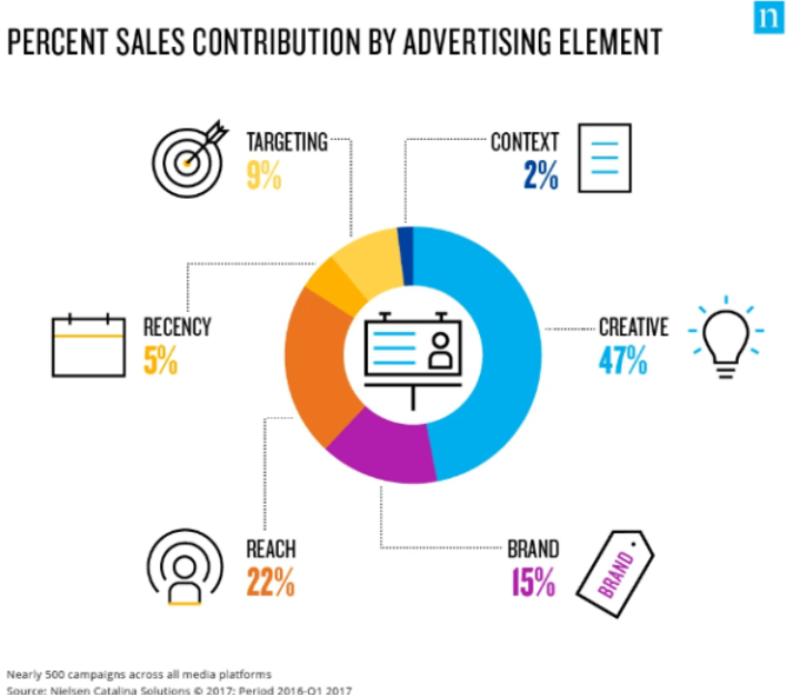
According to Nielsen Catalina Solutions, 2017, the creative element contributed 47% to sales compared to other advertising elements such as reach, brand, targeting and recency.
With that in mind, here is how to WIN and get ahead of your competitors with your YouTube creative.
The Right Type & Template
What is your objective?
Do you want to raise awareness? Do you want people to take action? How do you want the ad to look? These are the sorts of questions you should be asking yourself before the production process.
Below are three main design templates you can use for your ad creative:
- The Explainer Ad (that explains why the product or service is valuable to the viewer)
- The Demo Ad (show-not-tell ads that demonstrate the product/service)
- The Straight-Offer Ad (for products/services that don’t need to be explained)
Now, choose the type of ad format you would like to use based on your objective. Below are the most popular formats:
Bumper Ads
With our memory being worse than a goldfish, the ability to have short, high-frequency videos allows your brand’s messaging to be recalled. Bumper ads also help tease, amplify or echo the main narrative of longer-form ads.
Best for: Reach and Awareness
Non-Skippable
These ads are non-skippable, mid-length videos, about 15 to 20 seconds long, depending on country and market category. The longer length allows your brand’s key message to resonate better.
Best for: Consideration
TrueView InStream
TrueView InStream skippable ads are usually long-format video ads where brands develop a deeper narrative. At the five-second mark, the user can skip the ad and move on to watching grumpy cat videos or continue watching your ad.
Best for: Driving Leads or Conversions
Have An Emerging Story-Arc
Storytelling has changed.
Today’s consumer has an average of 6.1 devices. It’s something we don’t really think about but let’s see – smartphone, smart home device, laptop, smartwatch, computer…smart refrigerator, if that counts…
Because we are exposed to so many messages at one time, it’s hard to remember what was on the television 2 mins ago.
That’s why it is so important to provide that attention and engage the user in every way possible.
The emerging digital story arc is a new form of storytelling. Instead of a slow build-up that leads to the finale or pay-off, the emerging story arc starts with fire, moves fast and adds unexpected surprises along the way. Should a viewer choose to keep watching amidst his or her abundance of choice.
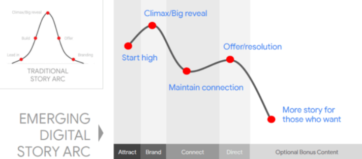
In the Emerging Digital Story Arc, there are three essential elements:
Visual Language
Frame subjects tightly and composes with high contrast so your ad gets noticed even on mobile.
Build for Attention
Whether you’re creating long or short stories, as long as the storytelling grabs and holds viewers’ attention, you are on the right track.
Ways to capture attention include:
- Using familiar faces
- Tight framing of key elements
Creative-In-Context
Based on user signals and intent data, ensure you are using the appropriate kind of ad template so the ad can connect with your target audience.
Consider:
Breaking the fourth wall: Many advertisers now use the anti-ad approach, where the actor speaks directly to the audience. It’s unconventional and surprises the audience. This approach is associated with high brand lift and helps viewers remember your message.
Old Spice ads are known for this approach.
Device Compatible
It’s almost bedtime, and you’re on your phone. Which ad would you rather watch?
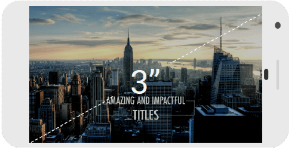

Drones videos are excellent, but watching it on a desktop device looks much nicer, don’t you think?
When you’re getting ready to sleep or on the train commuting to work, you don’t want to squint your eyes to see the message, don’t you ..?
You probably won’t bother concentrating on the message at all!
Your viewings on desktop and mobile are very different. So ensure you have a creative that is optimised for mobile screens by using:
- Fast cuts and pacing
- Bright footage (show up on dim phone screens)
- Close cropping (zoom in on faces and key details)
- Big Text /Graphics (stand out on small screens)
Klondike, an American ice-cream brand tested two ads with the same content but different framing on mobile. They saw a 15% increase in overall performance.

The ‘Techy’-Stuff
Composition
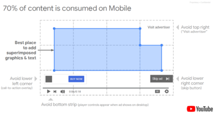
Ensure your editing team knows where to overlay text and subjects by providing them with these guidelines.
Consider Square and Vertical Aspect Ratios
70% of content is consumed via mobile devices and is increasing exponentially, which means out-of-the-box square and vertical video are becoming more and more relevant to use in your storytelling.
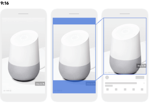
Vertical
On the right: How a vertical video appears if the viewer engages full-screen mode.
In the centre: The portion of a 9:16 vertical video that is cropped for the initial ad impression.
On the left: How the video ad appears upon ad impression.
Use the aspect ratio 9:16 for vertical videos. Avoid core messaging in the top 10% and bottom 25% of the video
What’s distinctive about this aspect ratio, is that it could be seen as most immersive because it utilises the entirety of a vertical screen.
Square
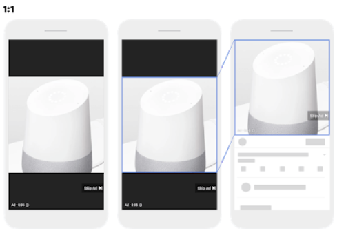
On the right: How a square video appears when the user engages in fullscreen mode.
In the centre: Cropping behaviour (none).
On the left: How the video ad appears upon ad impression.
Use the aspect ratio 1:1 for square videos.
Tip: Use the creative space!
The advantage of using vertical videos is that you can film a subject that looks better in a standing frame, such as a waterfall. You can even creatively split the vertical space into two and show similar or merging subjects stacked on each other. It's the same for square videos. Few viewers are familiar with squared YouTube ads, so showing them out-of-the-ordinary ad sizes could make your creative stand out.
Branding
Have you ever watched an ad you thought was amazing, but when someone asked you what company it was, you have no idea?
When developing ad creative, advertisers should be thinking about when and how the brand is introduced and used throughout the creative.
A good way to find this is first to define your marketing objective.
For example:
Top Funnel like Ad Recall
- Integrate brand in the first 5 seconds and then continue to brand your product or service throughout the ad
Mid Funnel like Consideration
- Introduce your brand later on to allow viewers to engage with your story and drive higher watch times
The next item you should be looking at is – audio.
Combine Audio and Visual
Audio mentions of your brand are associated with brand lift. Video with audio and visuals saw two times higher brand awareness and three times higher ad recall.
That way, even if someone’s not interested in watching, they still might hear what you have to say.
Tip: Make sure your creative matches the overall theme of your brand and advertising campaign. Use similar callouts and colour schemes.
| Type of Ad | The 'HOW' |
|---|---|
| Bumper Ad (upper funnel objectives) – 6-second ads | Focus on ONE value /offer /message. Appeal to reason, emotion or senses. |
| Non-Skippable (mid-funnel objectives) – Pre-roll ads which appear before a video plays Mid-roll ads which appear at the midpoint of 10 minute-or-longer videos | Utilise audio + visual stimuli. |
| TrueView (lower funnel objectives) – Reach Discovery In-Stream | The skip button shows at 5 seconds. Ensure you capture the users attention early within the first 5 seconds. Once you have captured the attention of the user, it is ‘ SHOWTIME. ’ At the end, you have your finale. Ensure a satisfying finish and call-to-action. |
Conclusion
Ensure your ad creative is not only relevant to your target audience but also engaging by capturing their attention in the first five seconds.
- Have creatives optimised for mobile devices and test them against your original.
- Use branding effectively depending on your campaign objective.
- Connect with your audience by experimenting with –
- Audio and Visual elements.
- Vertical and Square Videos.
- Breaking The Fourth Wall.
Written by
Luke Ashmore-Delaney


