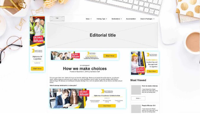
National Training - Design Case Study


The National Training challenge
The project's main objective was to give the National Training website a professional yet functional makeover while implementing best-practice SEO and boosting its visibility in SERPs.

Our methodology
We performed a research assessment to identify the users' pain points and goals, leveraging a variety of tools to gather data and analyse their behaviours.
After we discovered the potential User Personas, we developed new creative materials, reorganised the Information Architecture (IA) and prototyped the pages into an interactive wireframe preview.
After the prototypes passed all our tests, we handed over the mockups to the website development team to implement National Training's new updates.

The results
The new pages are visually more appealing than the previous site, and the responsive web development and implementations were integrated using their current CMS system.
The Page conversions improved, and National Training's new pages started getting visits and driving users via their Contact section and/or Get a Quote form.


