A digital evolution
With sharply honed digital skills, cybercitizens expect personalised experiences with responsive features, clean but innovative interfaces and a seamless user journey.
Brands, eCommerce sites and publishers are investing heavily in user experience and user interface design because, now – more than ever – the user experience in an online interaction is the deciding factor between bounce or conversion, sign up or opt-out, download or disregard; in short, success or failure.
What better way to demonstrate this than with a god old before and after! We’ve reviewed the top 20 websites in Australia and audited their homepage changes from the 2000s to the present day (2022).
The images on the left are how the websites looked on desktops in their early stages. On the right, you’ll see their 2022 transformations. And accompanying each? Our take on what’s changed and why.
Let’s go!
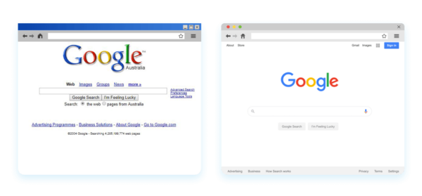
1. Google 2004 vs. Google 2022
From a UX perspective, Google’s style hasn’t changed for over 20 years. Their ‘less is more’ approach has always been about helping visitors to find answers to their burning questions in a click.
With their drop-shadowless logo (they ditched the drop shadow in 2013) and streamlined, virtually link-free appearance, you’d be forgiven for assuming that Google has stripped back it’s functionality but the opposite is actually true.
For example, while you could filter your search (which you can still do in the SERPs) and investigate advertising options from the homepage back in 2004, there was only one way to search – by typing your query in to the search box. Now? Well, take your pick! You can use voice commands, upload images and “Hey Google” to find out what you need.
In response, no doubt, to the strong desire for personalisation, Google also offers a ‘sign in’ option on their homepage (top right) which is a win for storing credit card details and passwords across devices, or when you want to re-visit a recipe you found on your work computer… and, voila, it’s in your browsing history!


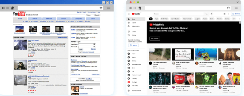
2. YouTube 2006 vs. YouTube 2022
‘Broadcast Yourself’ was YouTube's slogan in 2006, a year after the first user video was uploaded. They encouraged people to produce and publish their own video content (which was a reasonably new phenomenon) and allowed the community to rate and respond to the user-generated content.
Fast forward to 2022, and the platform boats over 2 billion active users. Nowadays, it exists just as much to house content as it does to deliver it in a relevant and personalised way. What users see is geared towards what they like, what the algorithm determines they might like... and what the advertisers targeting them are promoting.
It'll be interesting to see what comes next for YouTube as TikTok continues to soar in popularity. They might not have seemed like a clear and present danger to YouTube when videos were only 60 seconds long, but with TikTok recently increasing the uploadable length to three minutes, the new kid on the block is jostling for position.


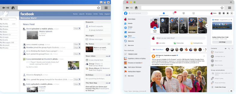
3. Facebook 2006 vs. Facebook 2022
Facebook has come a long way since its 2003 appearance on the scene as ‘Facemash’.
Since it re-branded to ‘Facebook’ in 2004, the platform’s primary offering has been the same – to host a directory of profiles for users so they can social network. What’s changed over time, however, is that profiles are more about showing – and the algorithm learning – what users are sharing and posting. It’s also geared towards exposing users to new content, connections and, of course, advertising.
Facebook of today is less about sharing general information like relationship status, gender, age, etc. or simply communing. It’s evolved to become the leader of the attention economy, piquing your curiosity about everything you’re interested in and what you didn’t even know you wanted to know. With prompts throughout the interface to ‘join this group’, ‘subscribe to this content’, ‘connect with that long lost friend’, ‘watch this video’ etc it’s the perfect ecosystem for advertisers, culminating in Facebook’s reported $117.9b revenue in 2021.
Like Google and YouTube, personalisation has become the platform’s stock-in-trade, but with it has come increasing calls for the tech giant to address mounting privacy concerns. It’s reported that Apple’s i0S update (in which Apple users are allowed to turn off tracking to preserve privacy) will cost Facebook $10b this year.
From a design point of view, Facebook has always been neat and practical. They don’t allow users to insert unnecessary HTML code, for example, and by denying this type of customisation, the platform has maintained a uniform and streamlined appearance.
Regarding functionality, Facebook is ‘keeping up with the Jones’s’. The launch of ‘Stories’ was likely an addition based on the threat posed to Facebook’s dominance by Snapchat and TikTok.


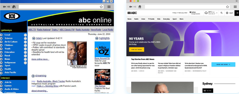
4. ABC 2000 vs. ABC 2022
A comprehensive rebranding of ABC Online stripped the core design of many unhelpful and irrelevant aspects that give the modern-day variation a sleeker look.
More focus has been shown on the visual storytelling of current affairs through high-resolution photography, whilst user navigation is concealed in the space between the masthead and newsfeed. 2022’s iteration of the site shows a more content-focused approach with the addition of location-filtered news and weather forecast functionality.
Another important leap has been the introduction of a subscription, which allows visitors to access extra features and improves user experience with personalised content.
With third-party cookies looking to be universally phased out shortly, ABC’s iView on-demand streaming platform will soon be accessible only to subscribed users.


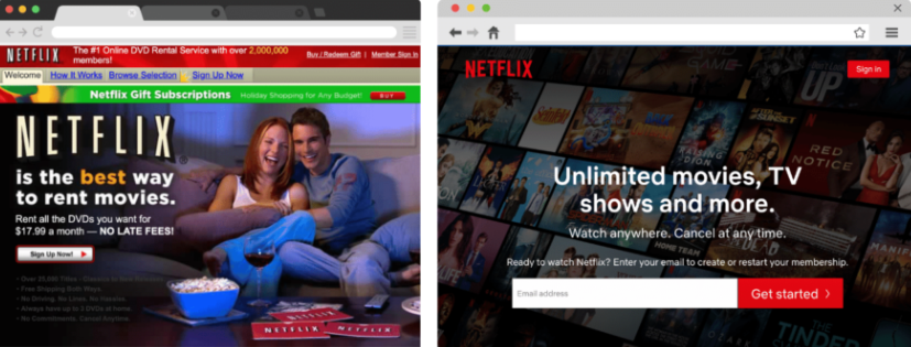
5. Netflix 2002 vs. Netflix 2022
Inarguably the Grand Poobah of streaming services, Netflix has come a long way since 2022. In contrast to Netflix’s homepage of old – which was adorned with offers, messages and imagery – when we wind the clock forward to 2022, we can see that the main ‘subscribe’ form field sits in pride of place in the middle of the screen, bringing clear focus to the aim of the game – signing up.
The little tidbit of copy above the sign up call to action is cleverly crafted to eliminate barriers and create desire – I mean, who could resist
“Unlimited movies, TV shows, and more.” that you can “Watch anywhere. Cancel anytime.”?
6,000,000 Aussies have found these to be compelling reasons to sign up.
When you’re all signed up and ready to go, the other evolution for Netflix emerges; their use of machine learning to customise the user experience and increase engagement. Machine learning and recommendations have been used and continuously improved upon on the platform since the late 2000s and, now, a whopping 80% of streams on Netflix come through their recommender system.


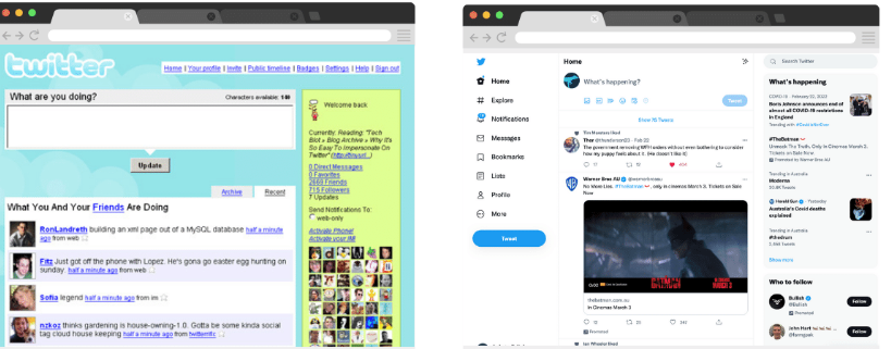
6. Twitter 2000 vs. Twitter 2022
Twitter, the go-to platform for just-in news, celebrity scoops and political unrest, makes the top 10 most visited websites in Australia.
Twitter hasn’t always been the news source that it’s evolved into, though. When it hit the scene in 2006, it was mainly used as a free way to send messages. The 140-character count was to make the messages page-friendly! (side note: it’s now doubled to 280) (side note: Gen Z readers, this is what a pager is/was).
Nowadays, the platform plays quite a different role in the social media scheme. It’s evolved into something akin to a newswire, which is reflected in its evolution. Barely recognisable from its early days, Twitter of 2022 is a slick information-gathering powerhouse. Users get an at-a-glance view of trending topics on the right; they can explore (via hashtags) and discover new accounts to follow, and, of course, all of it is underpinned by algorithms that serve you your very own content de jour.
Overall, the design has evolved to focus less on messaging and messages and more on promoting conversation, amplifying ideas and breathing life into trends – think #metoo and #blacklivesmatter – movements that may not have become the catalyst for widespread discussion about the need for social change if not for the ‘public square on steroids’ power of Twitter.

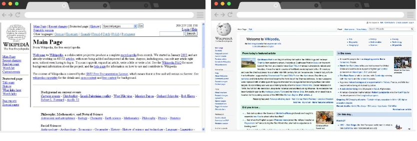
7. Wikipedia 2001 vs. Wikipedia 2022
While not much has changed on Wikipedia, it has moved with the times.
Unlike many of the other sites on the list that are backed by big budgets and crack digital teams, a small group runs Wikipedia (owned by the Wikimedia Foundation) on the payroll and also a much larger group of volunteers. It’s also funded by donations, philanthropists and other benefactors.
Not only does that mean that budgets are leaner than some (although they’re hardly poor), but it also means that:
“The Wikimedian community has a strong sense of ownership for the product, and rightly so: these are the people who write the articles. Thus, the community believes (correctly, in my opinion) that they should be consulted on changes to the interface. This process takes a great deal of time. It is rather glacial in its nature.” – Brandon Harris, Senior Designer, Wikipedia Foundation.
All the same, the site now uses more imagery and a colour categorisation system to help users journey around the main page. The platform also shrunk its logo and repositioned its table of contents to the top. The search feature is larger, and engaging content is available from the moment you land on the main page, in contrast to 2000 when the main page content was essentially a Wikipedia ‘About Us’.


8. News.com.au 2004 vs. News.com.au 2022
News.com.au has simplified its user experience and improved content discoverability by using comprehensive mega-menus that are simplified into nine clear links above the home page content.
The other notable difference is the way ads appear on the site. There are many varied ad units on the site, and they’re popular spots, with advertising revenues increasing 21% to $US405 million driven by growth in digital advertising across News Corps businesses.
In line with best practice user experience, News.com.au now allows users to sign up for a premium membership and create a personalised News.com.au experience with fewer ad interruptions.


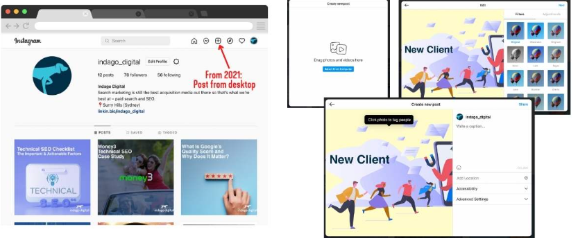
9. Instagram 2011 vs. Instagram 2022
Instagram has lived and breathed mobile since hitting the social stage in 2011. Until recently, users could view profiles on a desktop, but they had to publish on their iOS or Android device. That changed last year (2021) when they started allowing users to share, filter and edit content via desktop. Currently, Instagram stories and reel creation are still a mobile-only deal.
Another significant change from then to now is the removal of like numbers for non-business users in a bid to address the growing concerns over pressures and social issues arising from the Instagram-fuelled influencer culture.


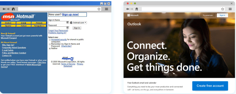
10. Outlook Live 2000 vs Outlook Live 2022
Previously called Hotmail, Outlook as it stands today amalgamates Hotmail, Live, MSN and, of course, Outlook itself.
Outlook’s facelift demonstrates what happens when a brand leaves its old identity behind.
Out with clunky sign-up instructions, in with a contemporary design that uses long images, short content and a call to action prompt you can’t miss.

11. Reddit 2007 vs. Reddit 2022
Reddit is often called the “front page of the internet” because of the informed and up-to-the-minute content contributed by its 52 million daily users. With over 430 million monthly active users and over 100,000 active communities, it’s ranked among the most popular social networks worldwide. (Source: Backlink.io)
The social news aggregator has experienced a monumental user experience shift from 2007 to now. Its former classifieds style began overhauling in 2018 to make way for a more user-friendly bulletin board vibe.
“Reddit isn’t a one-size-fits-all experience,” said Benjamin Rush, Senior UX Design Manager and one of the project leads on the redesign.
“We wanted to give users a choice around how they browse, how they consume, and how they create.”, he continued. “Whether you want to open a post in a lightbox or a new tab; whether you want to see a few big, visual cards or 14 posts on your viewport at once; or even if you want to keep experiencing old Reddit—we needed a system that was flexible enough to allow the creativity we saw in the last decade still flourish in the new world we were creating.”
The new Reddit allows users to browse pages in three different ways, and it boasts an infinite scroll. There are also other ways to create recent posts based on the type of content and a focus on imagery over the site’s former text heaviness. The redesign also gives users more customisation options for their profiles and communities.


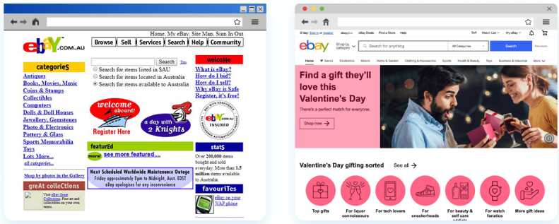
12. eBay 2000 vs. eBay 2022
The multinational online marketplace mega-star eBay hosts 1.5 BILLION listings (Source: eBay Investors). Being at the forefront of online buying and selling, they’ve changed and adapted over time to accommodate the preferences and needs of their enormous trading community.
“We redesigned [the home page] and built a lot of new algorithms to make it a science-powered hub for you,” said Bradford Shellhammer, the Vice President of Buyer Experience at eBay, in an interview with Medium.com. “And the goal was that there are 180 million active buyers on eBay, so there should be 180 million different eBays because everybody’s eBay is different.”
From a supremely cluttered link barrage of a homepage to a more organised catalogue system, eBay is one of the most important online retailers in the world and Australia’s 12th most visited website.
The homepage is in step with the evolution of consumer design, with more prominent and refined imagery used and category navigation moved to the top of the page. More than that, however, eBay has invested heavily in personalising the user’s shopping experience in line with Shellhammer’s ‘180 million different eBays’ goal by incorporating personal recommendations, product overviews, price comparisons and the introducing shopping events like the ‘Valentine’s Day’ example below.


13. Bureau of Meteorology 2001 vs. Bureau of Meteorology 2022
The forecast for the Bureau of Meteorology’s website design may be bright, but they looked bleak in 2001!
Gone are the twin sidebar columns of over-utilised hyperlinks and text. Instead, BOM of today offers interactive features like satellite videos and radar scans, capital city weather at a glance and simple top navigation that caters to the primary needs of visitors to the site in the form of weather warnings and access weather information for their area of choice (easily accessed by clicking through via the relevant Australian state or territory).
These components keep users nationwide in tune with changes simply and in real-time.


14. Yahoo 2001 vs. Yahoo 2022
In contrast to Google’s stripped-back minimalist design, Yahoo! AUNZ has moved away from its text-heavy days of yore. Still, it endeavours to be the ultimate homepage for your browser – combining news, entertainment, search, weather and more in one place.
Circa 2022, Yahoo!’s style is modern and image-centric; there’s a clear hierarchy of information for the user to navigate, and icons, buttons, and sections have a clear purpose.
Yahoo! has also set its sights on delivering a second-to-none personalisation experience that keeps users on site longer by serving relevant content that appeals to individual users while increasing opportunities for advertisers to get in front of their audiences. To achieve this, they’ve started rolling out fully customisable dashboards (currently US only and for Yahoo Mail users at first).
According to a Yahoo! spokesperson, “Nearly every piece of Yahoo will be part of a moveable dashboard, letting users create their own unique page based on their interests.
Modules featuring different topics like news, email, shopping, bills, to-do lists, sports teams and stocks let users build out the page to curate content and tools to personalize how the Yahoo website looks.” (Source: Digiday)


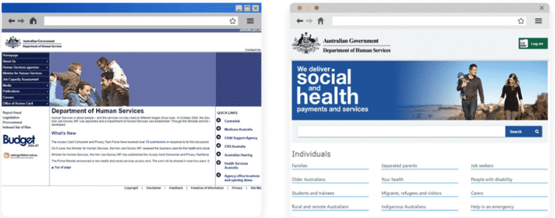
15. Department of Human Services 2006 vs. Department of Human Services 2018
Corporate website design in the public sector has its restraints. It’s not uncommon for a site like the Department of Human Services to exhibit minimal changes in its appearance and functionality. Tell-tale signs such as stock imagery are indicative of a risk-averse strategy.


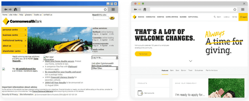
16. Commonwealth Bank 2004 vs. Commonwealth Bank 2018
Banking is perceived as a sector far removed from creative and visually stimulating website design. Commonwealth Bank has gone against the grain to demonstrate that less is more with a user-friendly composition. Punchy straplines and photography with a human touch are amongst the changes made to reassure customers of seeking banking information and services online.


17. Amazon 2001 vs. Amazon 2022
Amazon launched their Australian portal in December 2017, and since then, the North American online retail giant has gained an average of 11% of all online sales in Australia (Source: AFR).
No before and after, as Amazon only entered the Australian market in 2017.
18. Office 2000 vs. Office 2022
Microsoft’s Office.com provides software solutions for all users, from school students to government agencies.
Their homepage design evolution projects professionalism and also a balanced lifestyle, with their images often out of the office environment. They also use ample white space and keep things simple with just a few well-placed calls to action.


19. Service NSW 2000 vs. Service NSW 2022
The wide range of online services that Service NSW offers has contributed to the site’s elevated ranking position into the top 20 (and a pandemic might’ve been assisted, too). Service NSW started with a more institutional style with blocks of content for quick links to different areas, but it’s evolved into a masterclass in citizen engagement.
The site’s new user-centred approach is powered by Drupal, an open-source content management software and the foundation upon which the customer-facing website and the kiosk interface for users at service centres sit.
The push to overhaul the site came in 2013 when the government of the day decided to make a strong play for online information dissemination to alleviate pressure on the service.
In line with all the previous examples, Service NSW has kept pace by cleaning up its aesthetic, incorporating lifestyle imagery and making search a focal point, but, over and above that, they’ve invested heavily in making the site accessible, practical and valuable.
Their success is demonstrated by the numbers: 1200 government transactions available via the website, which has served 118.7 million user sessions since 2013! (Source: PreviousNext).


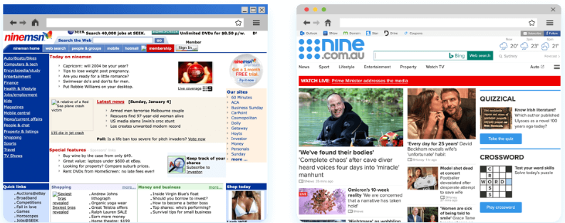
20. Nine.com.au 2004 vs. Nine.com.au 2022
Formerly ninemsn.com.au, Microsoft shed its investment in the platform in 2013, and it has subsequently been rebranded as nine.com.au. It’s an aggregated network of sites, including 9News, Nine’s Wide World of Sports, and 9Honey.
It used to have a sober and functional design, but it’s changed exponentially over time, as the before and afters attest. News.com.au now boasts the perfect balance of images and spaces to take it up to the minute.
We love the diversity of content with the mix of light entertainment, hard news, weather and Bing-powered search functionality. Its popularity is likely down to its positioning as an ideal one-spot-shop browser homepage option.


| Rank | Site | URL | Type |
|---|---|---|---|
| 1 | www.google.com | Search Engine | |
| 2 | Youtube | www.youtube.com | Social Media & Communities |
| 3 | www.facebook.com | Social Media & Communities | |
| 4 | ABC News | www.abc.net.au | News & Media Portal |
| 5 | Netflix | www.netflix.com | Entertainment |
| 6 | www.twitter.com | Social Media & Communities | |
| 7 | Wikipedia | www.wikipedia.org | Information Portal |
| 8 | News.com.au | www.news.com.au | Information Portal |
| 9 | www.instagram.com | Social Media & Communities | |
| 10 | Outlook Live | www.live.com | e-Mail and Media |
| 11 | www.reddit.com | Social Media & Communities | |
| 12 | eBay | www.eBay.com | e-Commerce |
| 13 | BOM | www.bom.gov.au | Information Portal |
| 14 | Yahoo | www.yahoo.com.au | e-Mail & Media |
| 15 | Real Estate | www.realestate.com.au | Real Estate |
| 16 | 9News | www.9news.com.au | Information Portal |
| 17 | Amazon | www.amazon.com.au | e-Commerce |
| 18 | Outlook Office | www.office.com | Internet & Telecom |
| 19 | Service NSW | www.nsw.gov.au | Government |
| 20 | Nine.com.au | www.nine.com.au | Information Portal |
* The results above exclude three entries owing to their inclusion of pornographic content.
Overall we can see that well-ordered and curated content is still king and personalised experiences are in high demand.
From a design perspective, we’ve seen an increase in the use of imagery and video assets while clumps of copy and reams of text links have done their dash. Logos are smaller and white space is being used to draw attention to the site’s focal points.
What’s next?
With the introduction of new digital ecosystems and decentralised metaverses we are in the verge of a change, the VR market is gaining momentum and its feasible that digital spaces will become the websites of the future, giving us a great opportunity to expand and diversify the way we connect with our target audiences and communities.

Written by
Tahlia Reynolds