
Data basics
The basics
Data is one of the most essential assets an organisation can own, in fact, it should have its own line item in the balance sheet. We all optimise our businesses and accounts based on the data we collect and how well we’re able to read it.
Simple data
As simple as this data format is, it can still be highly valuable. Combine enough simple data tables, and you’ll start creating complex data tables.
An example of simple data owning your clients’ email addresses or knowing your industry seasonality trends. Or what days of the week and times of the day do you get more conversions?
Complex data
Complex data is the most valuable type of data an organisation can own. To effectively manage complex data, though, quite often requires the use of a CRM system – but more on that another day.
An example of complex data is knowing which of your customers spend the most, how often they repeat purchases, as well as the channels most effective to reach those people.
Data management and analysis tools
Starting with Google Sheets, you can use any number of scripts (like this one) to pull your data into Google Sheets and integrate tools like Google’s BigQuery to draw insights from the data. That’s all good and well, but we’ve all used Google Sheets and know how inconvenient it can sometimes be.
That’s why Excel is still one of my favourite tools.
Analysing competitor activity
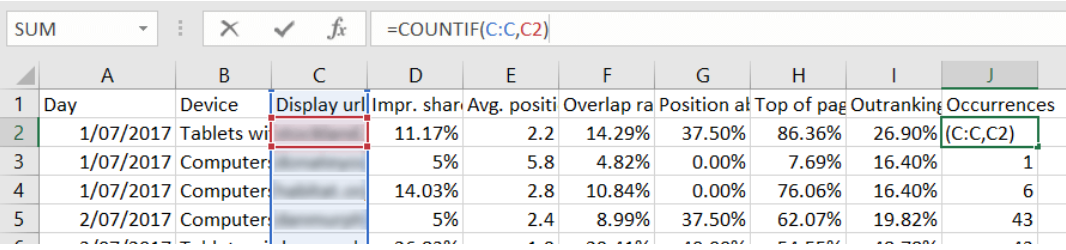
Google doesn’t like you to know too much about what your competitors are doing, so only provide the Auction Insights report. This report is not high-quality data; it’s quite boring as it doesn’t tell you anything. But download this report, add a segment for Day and Device, and we can make some magic happen.
NOTE: if you take a large time frame (more than 5 weeks or so, depending on data volumes) and segment by day, Google will sample the data.
The final export will not be pretty, so now it’s time to perform some data cleansing.
- Start by replacing all “<10%” with “5%” (we’ll assume that an Impression Share of <10% could be 5%).
- Next, we’ll add a new column to the end of the table and call it “Occurrences”.
- Use the formula =COUNTIF(range, criteria) and send this down to the end. This will allow us to filter out competitors who seldom appear in the same SERPs as you.


- Next up, create a Pivot Table of all the data using the following layout:
Filter = Devices; Occurrences;
Columns = Display URL Domain;
Row = Day;
Values = Sum of Impr. Share.
- Apply a filter on the Occurrences so that only the six highest numbers remain. As previously mentioned, we’re now filtering out competitors who seldom appear in the same results as you. This data cleansing will also allow you to generate a Small Data set with far more meaning, making it easier to draw insights from.
- The final step involves generating a chart from the Pivot. Your filters should still be applied to have a good-looking graphic representation of your competitor landscape by device. Add any custom styling and then paste it into your reports. Quick and easy!
NOTE: you can include as many competitors in the chart as you’d like in the chart, but things get messy the more you have.


Analysing times of day and week
I’m hoping you’ve all used this, but if not, do this one right away!
Everyone knows you can get the time of day and day of week data in the Dimensions tab. But how does that tell you whether your campaigns are performing better on a Monday lunchtime or a Thursday morning? Is there any point in running your campaigns on a Sunday morning on mobile devices?
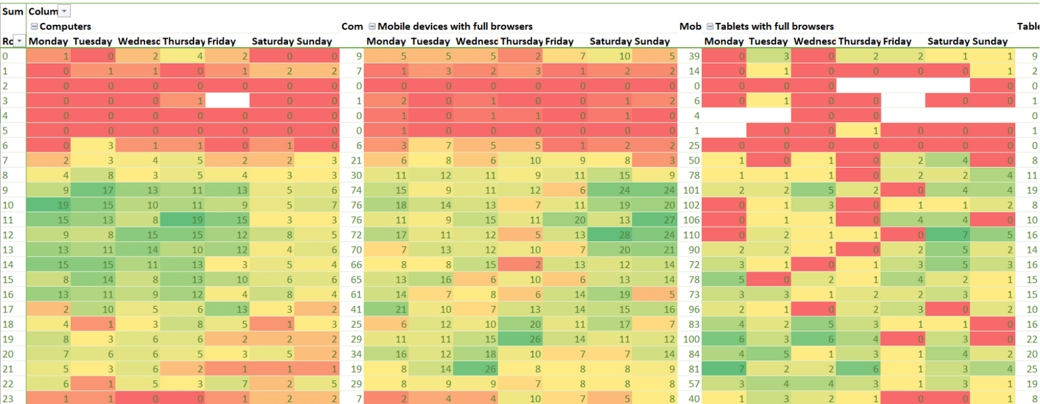
Luckily, it is possible to pull account data by Time of Day and Day of Week and compare this by device, navigate to your Campaigns tab, download the report for the last 28 days, and add a segment for Time of Day, Day of Week and Device.
NOTE: it is very important to have the same number of days of the week, or your data will be skewed, and you’ll lose all data quality.
Create a Pivot Table from the export (ensuring not to include the Totals rows at the bottom). The format you use is kind of up to you and what data you’re comparing, but this is the format I’ve used to compare each device alongside the others:
Columns = Device; Day of week;
Rows = Hour of day;
Value = Conversions or whichever other metric you are testing.
The resulting table is decent enough, but a bit of colour helps identify a pattern quickly and accurately if you're like me. Highlight the similar data you are analysing, and in the top Excel menu, select Conditional Formatting > Colour Scales > and choose the appropriate layout. As higher values are more important, I chose green to highlight these values. Do not highlight the Total columns and rows since these numbers are so much higher than the rest of the cells, and all other cells will look like “bad performers”. Rather, select these rows and columns separately and repeat the above steps.


How to use data
Having data, such as your clients’ email addresses, is almost as insignificant as you think, but it can be a very important optimization element. Email addresses could be used for EDMs, or they can be uploaded as a customer match list in AdWords or Facebook. You could then apply bid modifiers to either re-target these existing clients or neg the list to ensure you only target new customers.
Time of Day, Day of Week and Device can easily be used to optimize accounts towards the most profitable times per device. Being able to compare competitor activity by device could allow you to sneak into a tough or highly competitive market on a low-competition medium. Impression volumes may be low, but so are the costs while this is improving your ROI.
Data preparation
Preparing your data correctly can also make a massive difference in whether you can identify patterns.
For instance, take the ToD/DoW by device report above, and you’ll quickly pick up that computers are the primary device during office hours, while mobile devices get higher usage in the evenings, peaking on Saturday and Sunday mornings. Would you have been able to identify that trend without conditional formatting? I doubt it.
Looking at the Competitor report by day instead of week, you’ll quickly be able to identify which competitors push harder on a particular day of the week. You’ll also notice that your conversions are down on the same days, and your CPCs are up. Does this mean that your competitor is stealing your sales, and this is now an unprofitable day to compete? Or are you going to push even harder and get your customers back? You may also notice that you’ve recently started losing Impression Share. Pull the report without filtering for Occurrences and investigate whether a new competitor has entered the arena.
As funny as it is, the saying “Data, data everywhere and not a Byte to drink” is sadly true. Don’t just throw around numbers and tables; they mean nothing to anyone but their creator (and quite often not even them!). Rather, create a graphical representation of it in an easy format to draw insights from. If you can’t look at the representation and see a pattern, you’re doing it wrong.
Get in bed with your data, get comfortable with it, clean it, care for it, and then you’ll finally cure your case of data diarrhoea!

Written by
Preet Singh